Nowadays, just about everyone has a website. It might be a website that the company provides or one you have built on your own. Are you making that website stand out so that when people get to your website, they want to buy or engage with you? Having a website that stands out is all about color, appeal, design, simplicity, and layout. I can’t emphasize simplicity enough.
Why do you think the Google search page is one of the most common search pages ever? Simplicity. There’s not a lot of advertising, there’s not a lot of links, and there is a time of whitespace. Whitespace actually calms the mind and adds to the effectiveness of what you are really trying to say.
If you have 1000 links on your homepage and it is so busy that people have no idea what to do when they get there, they are just going to leave.
I’m going to show you a few of our customers that have great websites that offer lead capture, have an attractive layout and design, and easily direct people as to what they are going to do.
Attractive Front Page
Todd Blair, in Palm Beach County Florida, has a website that helps buyers and sellers of real estate. While he has hundreds of pages of information on his website, he doesn’t promote all of those on the homepage. He has buttons, and just a few links to lead you from one place to another. He starts with an attractive cover photo of a happy family. This evokes happiness and gives readers the desire to be in that place. A great tagline tells people what he can do and what you would feel like if you use his services. It’s simple, clean, and tells you exactly what he does, who he is, and where he is. I can’t tell you how many websites I have visited that I have no clue as to who they are, what they do, and what they are really selling.
You Have to Find and Know Your Target Audience
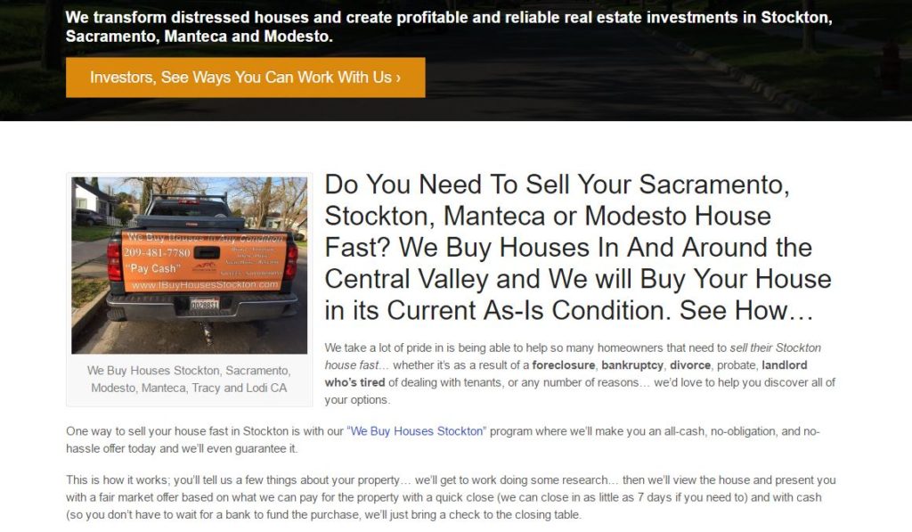
One of our other clients is an investor, not a real estate agent. His main directive is to help people that need to sell their home fast for cash. He’s not looking for a general homeowner that wants to fix up their house, stage it all pretty-like, and get the most money from the profits. He’s looking for people that have inherited an ugly house, have a house that they don’t want to worry about fixing up and just need fast cash, or people that need to get out of the house quickly as in a foreclosure or short sale. He appeals to this type of audience. But, you need to know your audience in order to market to them and sell to them. He’s not going to market to just any old homeowner. He has a target audience it that he focuses on.
Offer a Solution
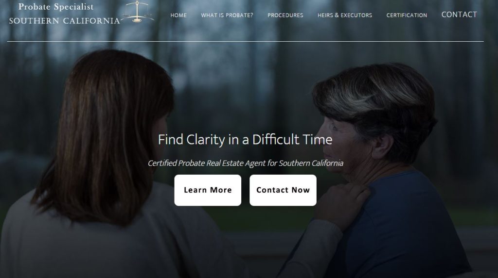
Your website should offer a solution for a common problem. Because we work with a lot of real estate agents, we help them solve their client’s problems by setting up the website to first create a problem and then solve it. This might sound funny but stay with me. If people are looking for your business there is some type of problem they are trying to solve. If they are looking for a real estate agent either need to buy a house or sell a house. If you can quickly and easily state the problem and a solution in one sentence, you’ve captured that client. Our client down in Irvine California works with probate real estate.
In their first tagline “Find clarity in a difficult time” states that the problem is a difficult time, usually a death or grieving because of the probate in the title, and the solution is to find clarity by using this real estate agent or this website. It is simple, clean, and the background photo offers a comforting touch and feeling during an odd and confusing time. We’ve also stated exactly what the website does, how to learn more and how to contact the agent.
Offer a Niche
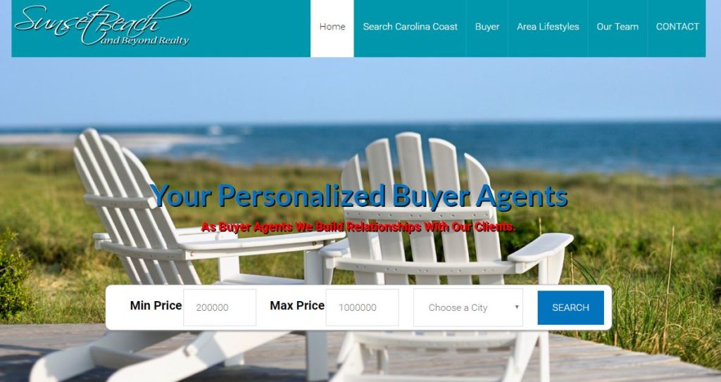
Yes, you can probably do everything when it comes to your industry but do you specialize in just one thing? Be the best at that thing. As our clients in Sunset Beach do, they are professional buyer’s agents. They love working with buyers and it shows. Everything about their homepage helps buyers find a house they love and read more about their area. They know their area and how to buy homes there. They also have the search feature front and center.
Give them a reason to look more.
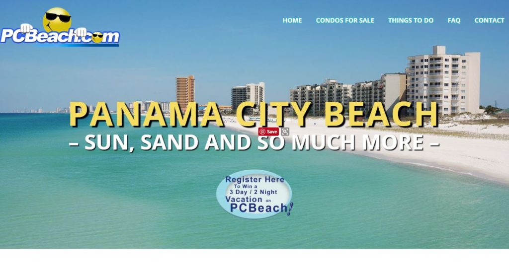
As we stated that your website needs to be clean, simple, with a direct call to action but it’s also important to give them a reason to look more. As our client PCbeach.com does with their website in a contest front and center. You can see below that visitors can sign up to win a free vacation in Panama City Beach Florida. Just because of this he gets lots of sign-ups, a lot of emails to add to his database, and continually markets to those people on a regular basis without being annoying. The menu is also clear. It only has four additional things for you to do. Too much information and too many choices and overwhelming.
Offer Fewer Choices
It might seem counterproductive to offer fewer choices but actually, our brains can handle no more than about 2 to 4 choices at one time. This is why you stand in front of the candy aisle or drink case with 100 different choices and have no idea what to choose. Our brains seem to function better with fewer choices. We can make a better decision and a faster decision when we are given a fewer choices.
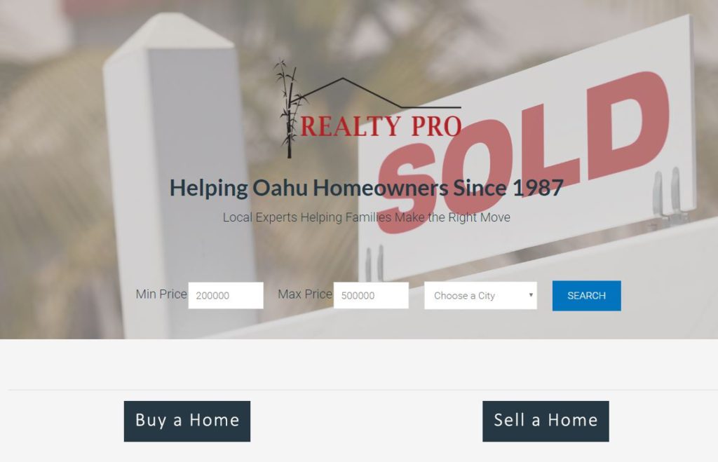
Our client in Oahu does a beautiful job on her website. There are two main choices; Buy a Home and Sell a Home. It’s simple, clean, and usually people that are looking for real estate are doing one of those two things. There is an option to search for real estate as well, but those two buttons can open the doorway to a lot more information. I have clients that feel the need to divulge all the information upfront and give everybody every choice under the sun so they know what to do. That is not the way our brains work. It’s important to offer them to simple choices, three at most. A lot of times those buttons can say “contact me”, “learn more”, or simply prompt the visitor onto more information.
Tell them what to do
People have no idea what to do once you get to your website there simply going to leave. You have to tell them what to do and what you want them to do when you get there. Our client that rents out RVs has several great taglines on their homepage. Their main button prompts people to start their adventure with “Adventure, here I come!”. It leads them right on into the page that talks about all the different ways you can rent an RV in the Puget Sound area. Below that, it talks about three simple ways you can get your trip started. It’s telling people what to do, and how to do it.
Create a website that will stand out and offer the traffic and leads you really want. Maybe it’s time to revamp your website? We do that! Give us a call for pricing and how we can make your website stand out.


